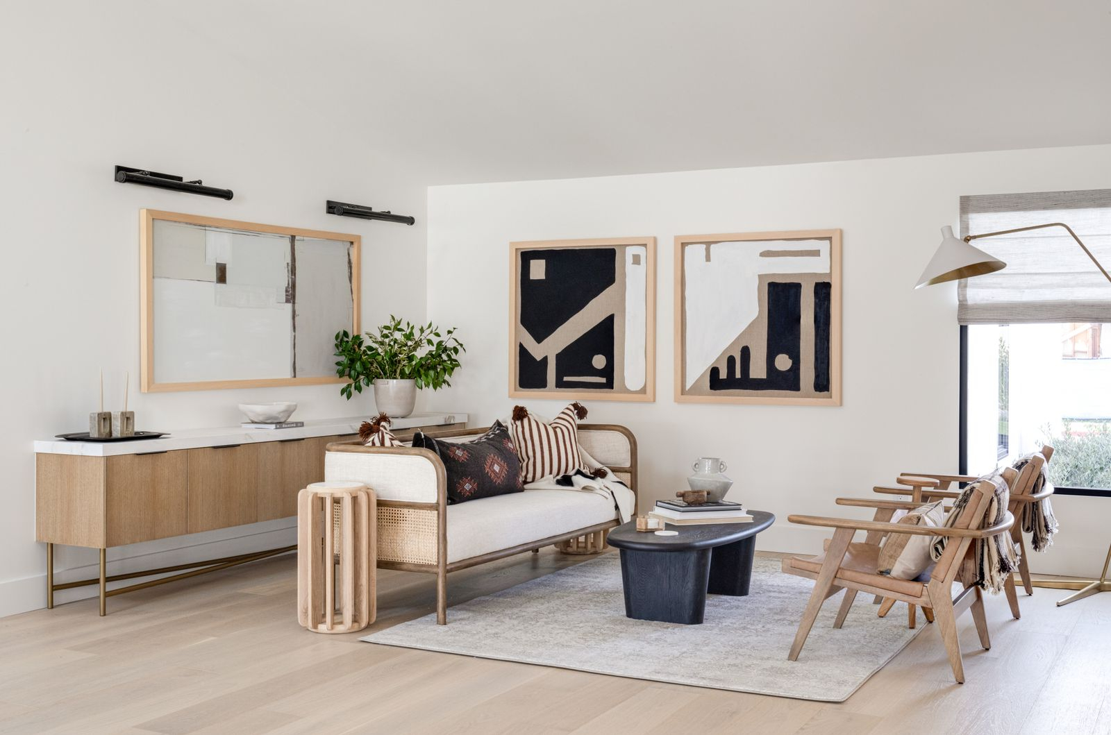
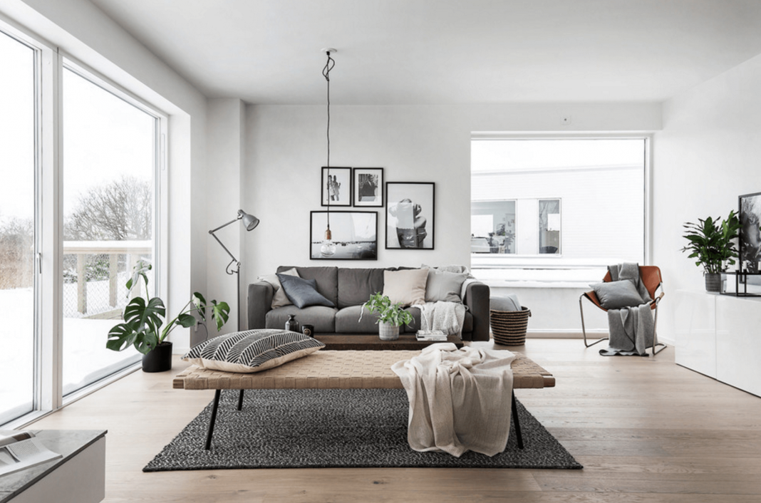
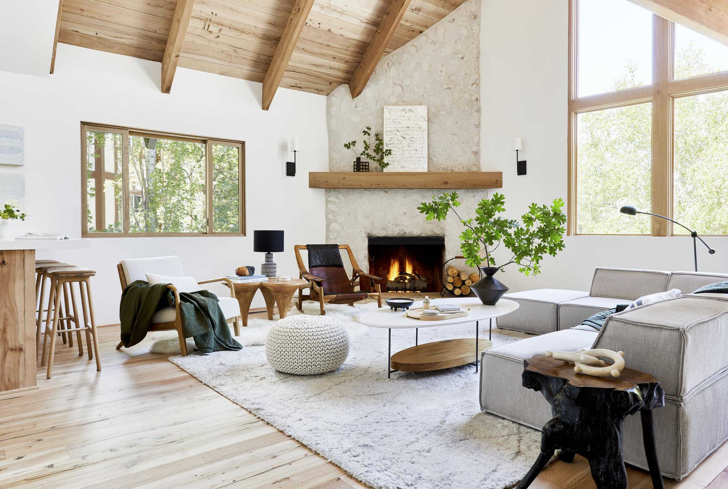
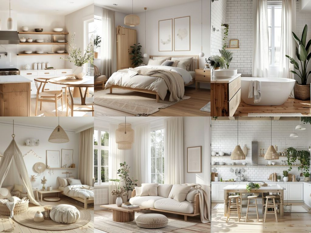
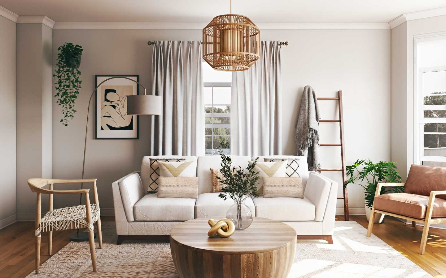
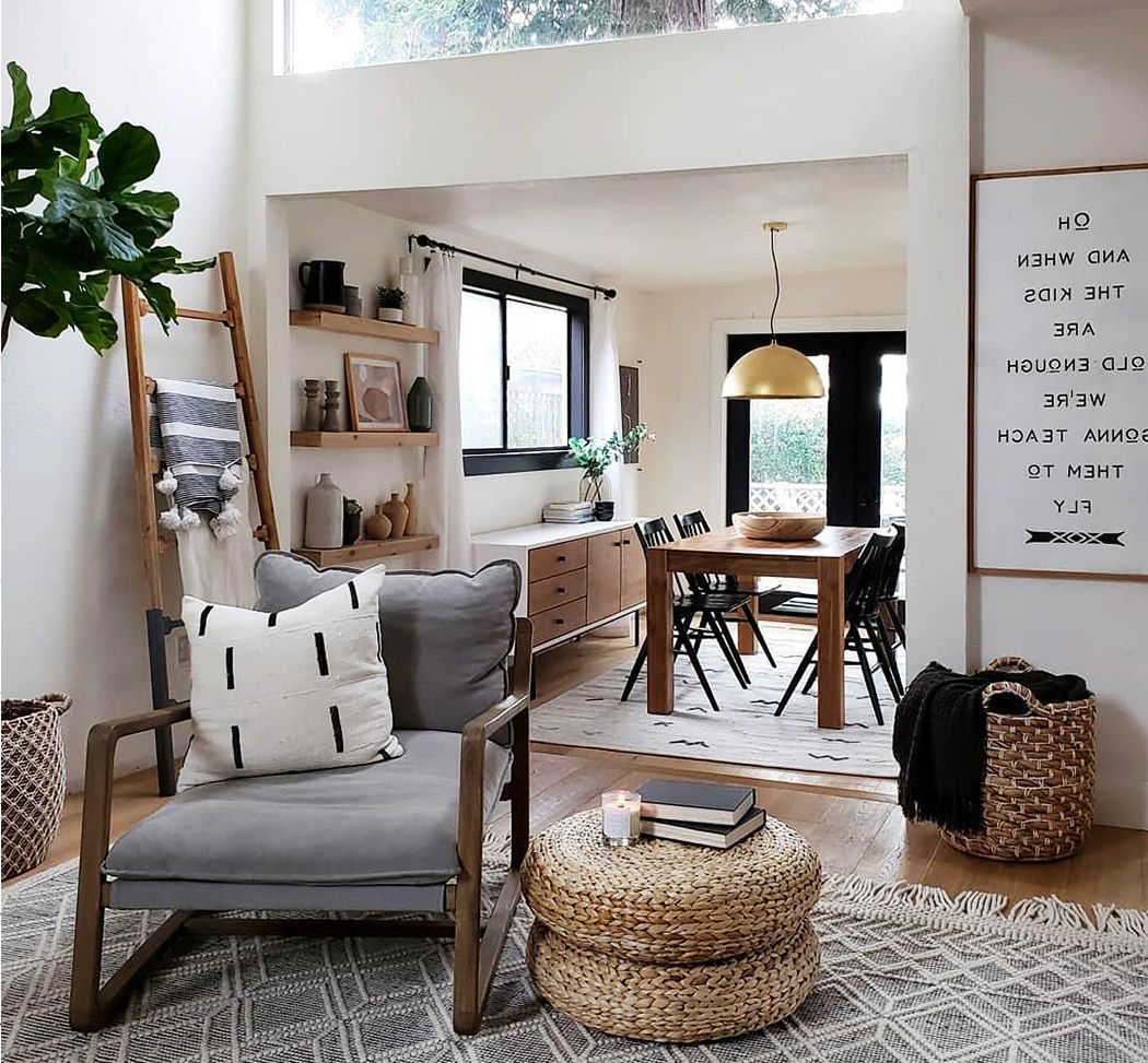
There’s something magical about Scandinavian interiors that makes them feel both fresh and comforting. It’s not just about the furniture or the clean lines. It’s about how colors work together to create a feeling of peace and wellbeing. Think of those cozy cabins you’ve seen in movies – the kind where you want to curl up with a book and a warm drink. That’s the power of the right color palette.
When you think of Scandinavian design, what comes to mind? Maybe it’s the minimalist furniture, or perhaps the way light seems to dance through large windows. But there’s another element that often gets overlooked – the colors. The Scandinavian approach to color isn’t about bold statements or dramatic contrasts. Instead, it’s about creating harmony through subtle, thoughtful choices. These aren’t just random hues thrown together. They’re carefully selected to make spaces feel welcoming, airy, and deeply calming. Whether you’re redecorating your entire living room or just want to refresh your bedroom, understanding these color principles can transform your space in ways you might not expect.
The Foundation: White as Your Best Friend
White isn’t just white in Scandinavian design. It’s the canvas upon which everything else plays. Think of it as the breathing room in a symphony – essential but not overpowering. In Scandinavian interiors, white walls often feature subtle variations, creating depth without clutter. This isn’t the stark, clinical white you might find in hospitals. It’s more like the soft, creamy white of fresh snow after a gentle fall. This foundational hue allows natural light to bounce around the room, making even the smallest spaces feel larger and brighter. You’ll notice that white serves as the base layer, while other colors add pops of personality on top. It’s like having a blank page ready for your next great story.
Nature’s Influence: Earth Tones and Natural Shades
Scandinavia’s landscape has a profound impact on its color choices. The region’s forests, fjords, and long winters have taught designers to appreciate earthy tones that connect us to nature. Think warm browns, muted greens, and soft terracotta. These colors don’t scream attention – they whisper comfort. They’re the colors of moss-covered stones, of pine needles on the forest floor, and of sun-drenched wooden floors. When you incorporate these hues, you’re essentially bringing a piece of Scandinavia’s natural beauty into your home. A deep forest green on an accent wall can instantly make a room feel more grounded, while a warm beige sofa adds that essential touch of warmth that makes a space feel lived-in and loved.
The Art of Subtle Contrast
Good design knows when to use contrast and when to avoid it. Scandinavian design embraces subtle contrast rather than dramatic clashes. This means using lighter and darker versions of similar colors to create visual interest without overwhelming the senses. Imagine a room where cream walls meet deep navy blue accents. The contrast is there, but it’s gentle enough to feel peaceful rather than jarring. This technique works especially well with neutral tones, allowing you to create depth and dimension without resorting to flashy colors. It’s the difference between a space that feels busy and one that feels balanced. The key is choosing colors that complement each other rather than compete.
Accent Colors: Adding Personality Without Overpowering
While Scandinavia is famous for its restraint, it’s not about boring or bland spaces. The secret lies in choosing one or two accent colors that reflect your personality without dominating the overall scheme. These aren’t necessarily bright or bold – they’re often soft pastels or muted jewel tones. Think soft lavender, dusty rose, or sage green. These colors can appear in throw pillows, artwork, or small decorative items. They’re like little surprises that keep the eye interested while maintaining the overall calm atmosphere. The trick is to choose colors that have a natural connection to the main palette. Using a soft blue in a predominantly white and wood space creates cohesion rather than chaos.
Wood Tones: The Heart of Scandi Design
No Scandinavian palette is complete without the warmth of wood. Whether it’s light oak that brings brightness or rich walnut that adds sophistication, wood tones ground the entire scheme. These natural textures provide visual and tactile interest that’s hard to replicate with paint alone. Consider how a light wood dining table can make a small kitchen feel more spacious, or how dark wood floors can anchor a room filled with lighter elements. The beauty of wood tones is their versatility – they work equally well in modern and traditional settings. They also age beautifully, developing character over time that makes your space feel more personal and lived-in.
Practical Tips for Creating Your Own Scandi Palette
Creating your own Scandinavian-inspired color scheme doesn’t require expensive materials or professional help. Start with the basics: white walls, natural wood tones, and some earthy accents. Try adding a few pieces in muted colors – maybe a soft gray chair or a warm brown side table. Test your palette in different lighting conditions throughout the day, as natural light changes dramatically. Consider using a color wheel to help you select complementary shades that will work together harmoniously. Remember that less is often more. You don’t need to match every single element perfectly – the beauty of Scandinavian design lies in its relaxed approach to perfection. Let your space breathe, and don’t be afraid to add personal touches that make it uniquely yours.
Scandinavian color palettes offer more than just pretty pictures – they provide a framework for creating spaces that truly support wellbeing. By focusing on light, natural tones, and subtle contrasts, you can transform any room into a sanctuary of calm and comfort. The magic isn’t in following rigid rules but in understanding the underlying philosophy behind these colors. They’re designed to make you feel good, to encourage relaxation, and to create spaces where you actually want to spend time. Whether you’re starting from scratch or updating existing decor, these principles can guide you toward a more peaceful and beautiful home environment. The best part? These colors work across all seasons and styles, making them a smart investment for any home.


