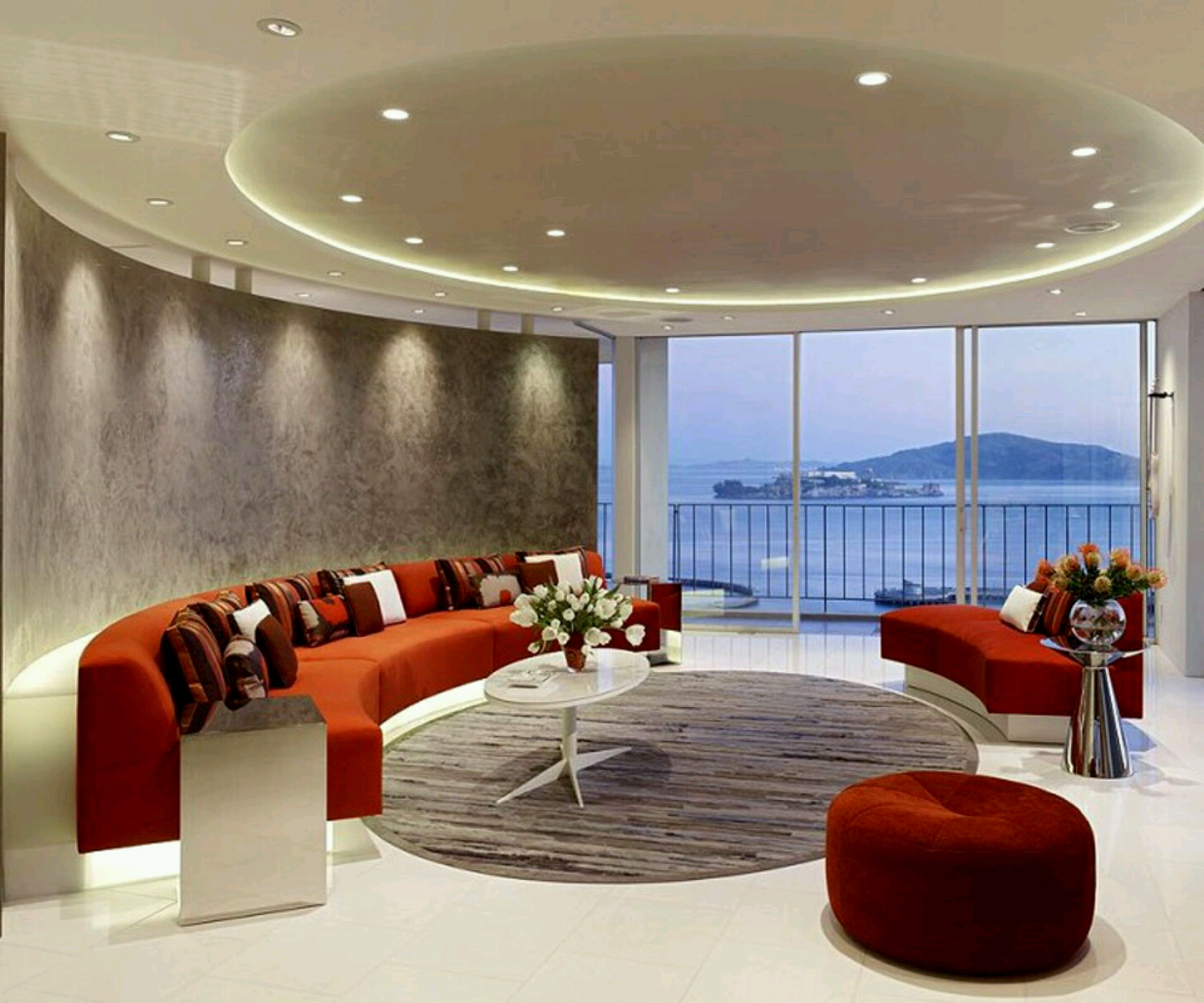
Color isn’t just about decoration—it’s the silent storyteller of modern interiors. Every hue, every shade, every carefully selected palette speaks volumes about the personality and lifestyle of those who inhabit these spaces. Today’s design landscape shows us that choosing the right colors can transform a house into a home, turning ordinary walls into extraordinary canvases.
In the world of interior design, few elements carry as much weight as color selection. Modern design has evolved beyond simple aesthetics to become a powerful tool for creating mood, defining spaces, and expressing personal identity. The color schemes we choose don’t just decorate our homes—they influence how we feel, how we interact with our environment, and how we experience daily life within these walls. From minimalist sanctuaries to bold artistic statements, the right color palette can elevate any space from ordinary to extraordinary.
The Foundation: Neutral Tones in Modern Design
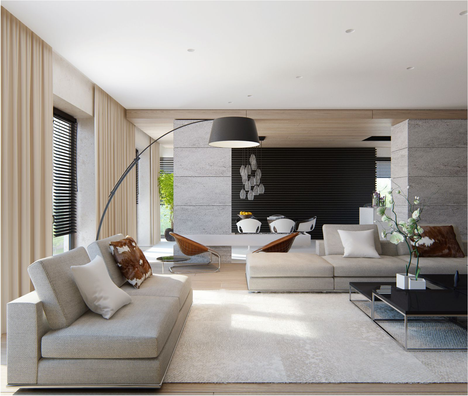
Modern interior design often begins with neutral foundations that provide stability and versatility. These base tones create breathing room for other design elements while establishing a calm backdrop that allows focal points to shine. Think of whites, grays, and soft beiges as the canvas upon which your entire design story unfolds.
Consider how a pure white ceiling can make a small room appear larger and more open. Or how a warm gray base can add sophistication without overwhelming the senses. These neutral hues work especially well in contemporary spaces because they reflect light beautifully and create an airy, uncluttered feeling that many people find soothing.
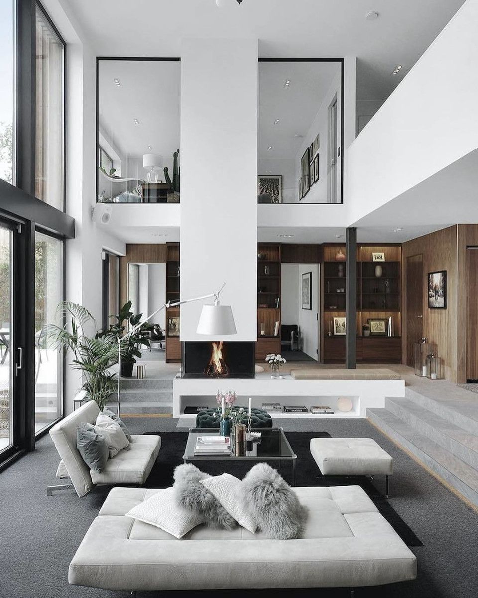
Many designers swear by the ‘rule of three’ when working with neutrals—using one dominant neutral, one secondary neutral, and one accent neutral to create visual harmony. This approach prevents monotony while maintaining that clean, modern aesthetic that defines current trends.
The Power of Monochromatic Schemes
Monochromatic color schemes might seem simple, but they’re incredibly sophisticated and versatile. When you work with variations of a single color—say different shades of blue or green—you create depth and interest while maintaining visual cohesion. This approach works exceptionally well in modern interiors because it emphasizes clean lines and geometric shapes.
Imagine walking into a living room where every element from the sofa to the artwork uses different tints of navy blue. The result? A space that feels unified yet dynamic, where each piece contributes to a larger visual narrative. The beauty lies in how subtle changes in saturation and tone can create visual texture without adding complexity.
This technique also makes it easier to update your space over time. If you decide you want to shift the mood slightly, you can simply adjust the lighter or darker versions of your chosen hue. It’s like having a wardrobe that adapts to your changing moods.
Bold Accents: The Pop of Contemporary Style
While neutrals provide the foundation, modern design thrives on unexpected pops of color that create excitement and personality. These accent colors don’t need to be flashy or loud—they just need to be intentional and purposeful. The key is choosing one or two vibrant hues that complement rather than compete with your neutral base.
Consider how a deep emerald green throw pillow can transform a stark white sofa into something memorable. Or how a bright coral vase can energize a minimalist corner. These moments of color create visual anchors that draw the eye and add character to otherwise plain spaces.
Current trends favor muted versions of bold colors rather than their most saturated forms. Think soft terracotta instead of blazing red, or sage green instead of electric lime. These more subdued versions still pack a punch while remaining versatile enough to work in various lighting conditions and throughout different seasons.
Earth Tones: Nature-Inspired Modern Design
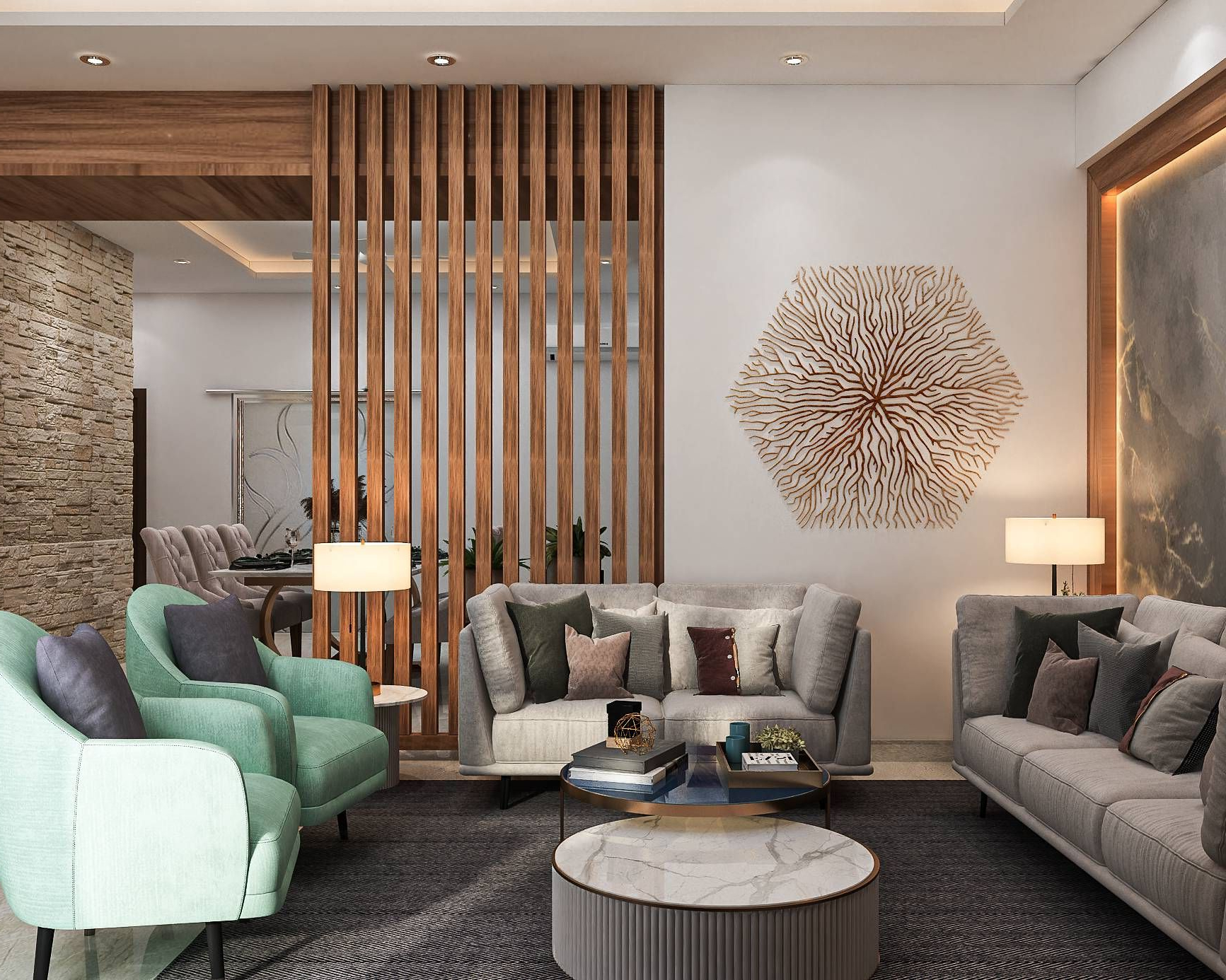
There’s something deeply comforting about earth tones in modern interior design. These naturally inspired colors—browns, terracotta, olive greens, and warm ochres—create a sense of groundedness that balances the sometimes clinical feel of contemporary architecture. They bring warmth and organic texture to spaces that might otherwise feel too sterile.
Think about how a rich burgundy armchair can anchor a room full of cool grays and whites. Or how warm terracotta tiles can add personality to a bathroom without overwhelming the overall aesthetic. These colors work particularly well in modern homes that embrace natural materials like wood, stone, and linen.
The beauty of earth tones lies in their ability to age gracefully. While trendy colors may go out of style quickly, earth tones tend to remain appealing for decades. They create a sense of permanence and sophistication that many homeowners find appealing.
Cool Blues and Grays: The Modern Classic
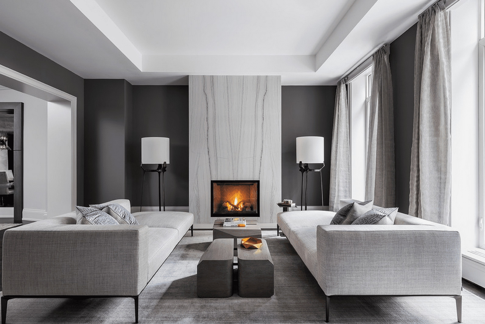
Blues and grays have emerged as the undisputed favorites of modern interior design. These colors offer that perfect balance between calm and sophistication that many people seek in their living spaces. Cool blues can make a room feel spacious and refreshing, while grays provide that sleek, contemporary look that defines so many successful modern designs.
A well-chosen blue can transform a dark hallway into a bright, welcoming entryway. Similarly, the right gray can make a small kitchen feel more expansive and airy. These colors work exceptionally well together, creating harmonious environments that feel both relaxing and stimulating.
Designers often recommend starting with a cool blue as a primary color in bedrooms and bathrooms, where tranquility is paramount. For living areas, they suggest experimenting with different shades of gray to create layers of depth and visual interest. The key is understanding that these colors don’t have to be uniform—they can vary in intensity and undertone to create dimension.
Practical Tips for Choosing Your Palette
Selecting the right color palette involves more than just personal preference. Here are some practical approaches that can guide your decision-making:
• Start with a small area of your space to test potential combinations before committing to larger surfaces
• Consider the natural light in your rooms—some colors look completely different depending on whether they’re bathed in morning sun or evening glow
• Take into account the existing furniture and decor items that will coexist with your new color scheme
• Remember that colors can change dramatically under different lighting conditions
• Don’t forget to consider how your chosen palette will evolve over time and seasons
One helpful method is to create a color swatch board using actual paint samples or fabric swatches. This allows you to see how colors interact in different lighting and helps prevent surprises once you’ve painted or decorated your space. Many designers also recommend bringing in a professional color consultant if you’re feeling overwhelmed by choices.
Color remains one of the most powerful tools available to anyone looking to shape their living environment. In modern interior design, thoughtful color selection goes far beyond mere decoration—it becomes an expression of personal taste, lifestyle preferences, and even psychological needs. Whether you prefer the quiet confidence of neutral tones, the dramatic impact of bold accents, or the timeless appeal of earth tones, the right palette can transform any space into a reflection of who you are and how you want to live. The key is understanding that color choices aren’t random—they’re deliberate decisions that shape the emotional landscape of your home. As you navigate your own design journey, remember that there’s no single correct approach. What matters most is finding a combination that feels authentic to you and creates the kind of space where you truly want to spend your time.


