Every kitchen designer knows that choosing the right colors isn’t just about personal preference. It’s about creating spaces that feel fresh and inviting for decades. The best kitchen colors balance current trends with timeless appeal, ensuring your investment pays off both aesthetically and financially.
Selecting the perfect color palette for your kitchen feels like picking the right outfit for a first date – you want something that makes you feel confident and looks great on everyone. But unlike fashion, kitchen colors can stick around for years, sometimes decades. That’s why finding that sweet spot between trendy and timeless matters more than ever. The right color choices can transform your space, boost your mood, and even increase your home’s value. What makes a color truly timeless? It’s not just about being neutral – though that’s a solid foundation. It’s about selecting hues that work with different lighting conditions, complement various textures, and age gracefully while maintaining their appeal.
The Power of Neutral Foundations
Neutral tones have always been the backbone of successful kitchen designs. They offer flexibility, versatility, and that classic sophistication that never goes out of style. White kitchens, once considered too simple, now represent the epitome of clean, modern design. But white isn’t just white – there are countless variations that can add depth and character to any space.
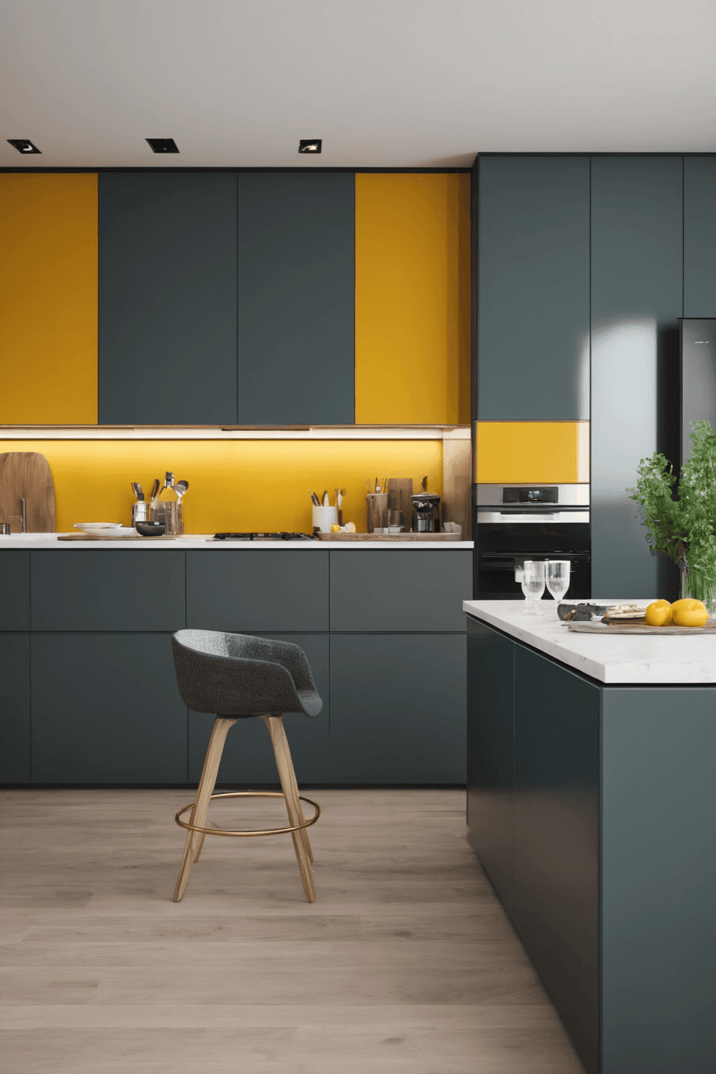
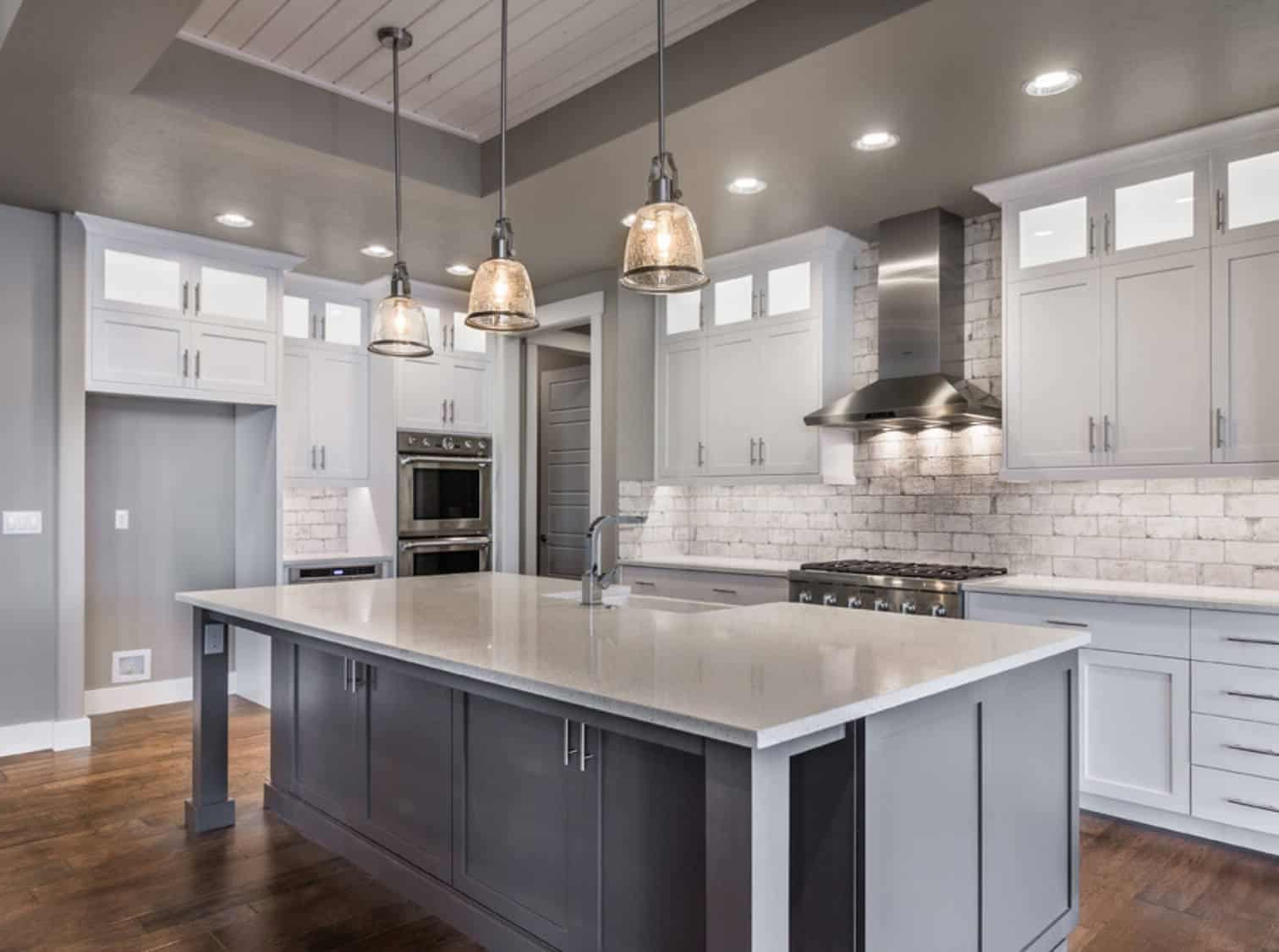
Gray has emerged as one of the most popular choices in recent years. Light gray kitchens create a calm atmosphere, while deeper grays provide drama and contrast. The key is choosing the right shade for your space.
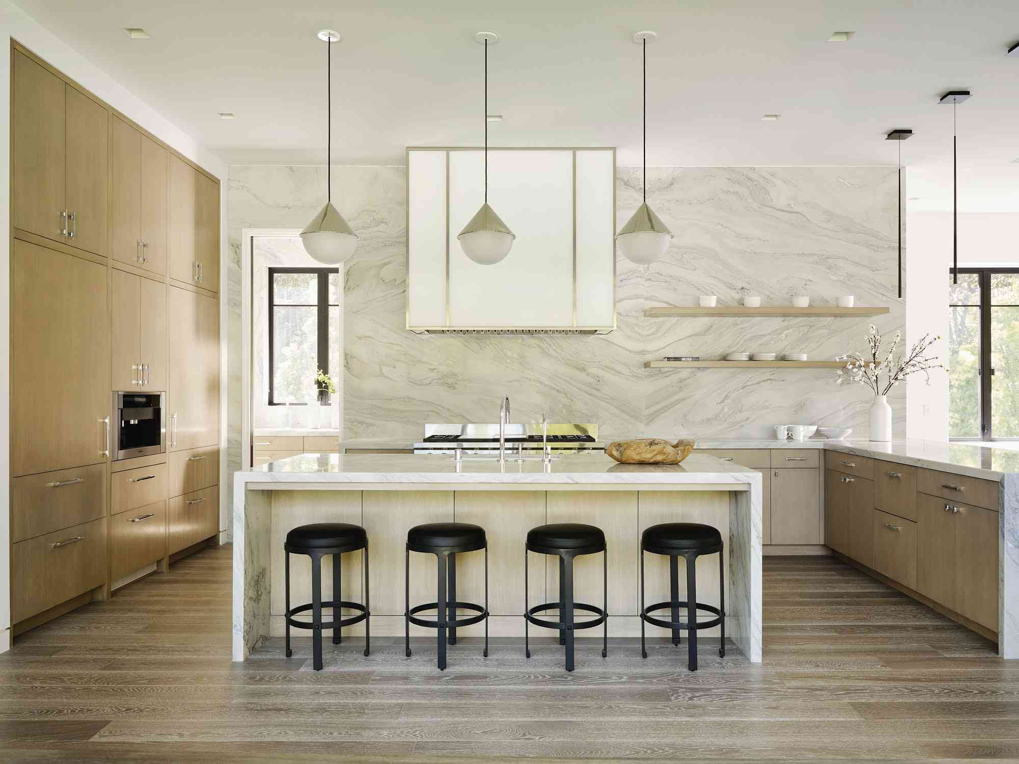
Beige and cream tones offer warmth and elegance. They work beautifully with wood elements and natural materials, creating a cozy yet sophisticated environment. These colors tend to age well because they’re forgiving of wear and tear.
Natural wood tones bring organic beauty to any kitchen. Whether you choose light oak, rich walnut, or warm chestnut, wood tones create visual interest while maintaining that timeless quality. They’re particularly effective when paired with contrasting cabinet colors or backsplashes.
Classic Blues That Never Disappoint
Blue might seem like a bold choice, but certain shades of blue have proven themselves as reliable kitchen contenders. Navy blue cabinets create a striking focal point, especially when paired with lighter countertops and hardware. This combination offers excellent contrast while remaining elegant.
Powder blue, on the other hand, brings a cheerful, airy feel to smaller kitchens. It’s perfect for those who want to add a pop of color without overwhelming the space.
Teal and turquoise are also worth considering. These colors have a unique ability to make a kitchen feel both modern and traditional. They work particularly well in coastal or farmhouse-style kitchens.
When choosing blue hues, consider the room’s lighting. Natural light can make deep blues appear almost black, while artificial lighting can change the entire perception of color. Testing samples in different times of day helps ensure you get the right effect.
Warm Earth Tones for Cozy Appeal
Earth tones have an incredible ability to make any kitchen feel welcoming and grounded. These colors draw inspiration from nature, bringing a sense of calm and stability to busy kitchen spaces.
Warm browns and tans create a rustic yet refined atmosphere. They pair wonderfully with natural stone, wood accents, and vintage fixtures. These tones are particularly effective in kitchens with exposed brick or stone walls.
Terracotta and burnt orange add vibrancy without being overwhelming. They work especially well in kitchens with lots of natural light, where they can brighten the space without feeling harsh.
These warm tones age beautifully because they’re naturally forgiving. They don’t show water stains or daily wear as prominently as brighter colors, making them practical choices for high-traffic areas.
Black and White Pairings That Work
The classic black and white combination remains one of the most powerful color schemes in interior design. When applied to kitchens, it creates a dramatic yet clean look that works in virtually any style.
White cabinets paired with black countertops create a bold statement. This contrast is particularly effective in modern kitchens with clean lines and minimalistic design. The key is balancing the two colors properly – using white for cabinetry and black for islands or countertops.
Black cabinets with white countertops offer a more subtle approach. This combination provides the sophistication of dark cabinetry while maintaining the brightness and openness that many homeowners desire. It’s particularly popular in contemporary kitchens.
Both approaches benefit from strategic lighting. Proper illumination ensures that the contrast enhances rather than overwhelms the space. Consider adding under-cabinet lighting to highlight the dramatic effect of these color combinations.
Green Hues That Bring Freshness
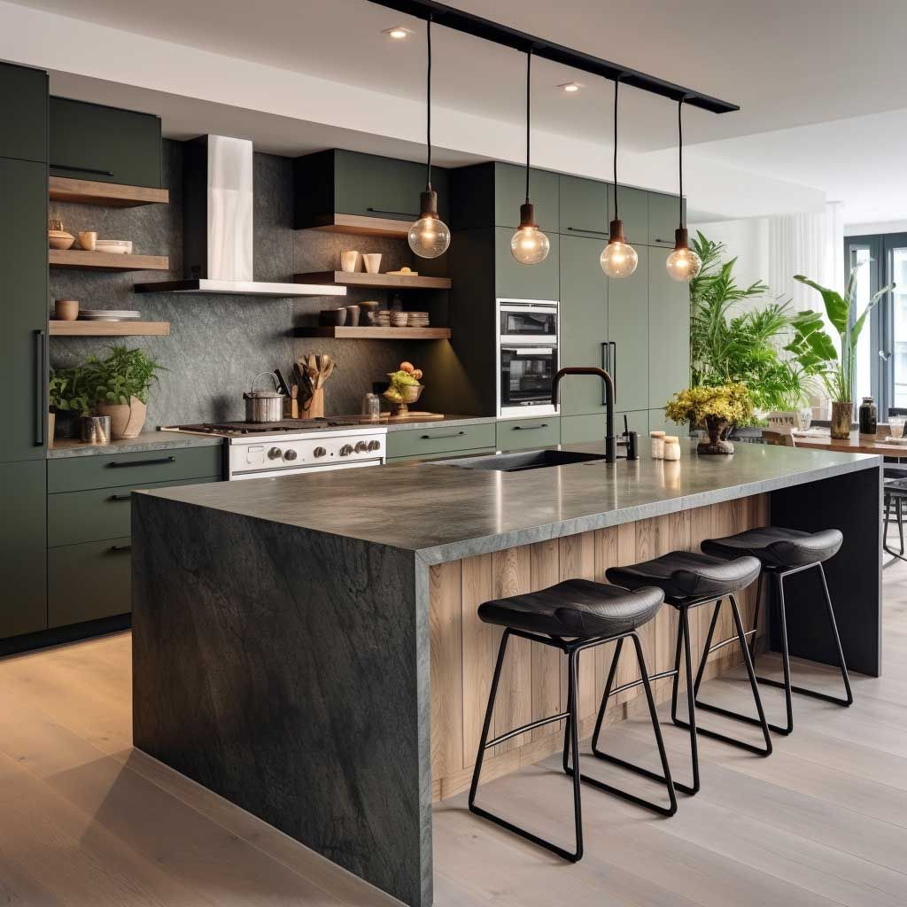
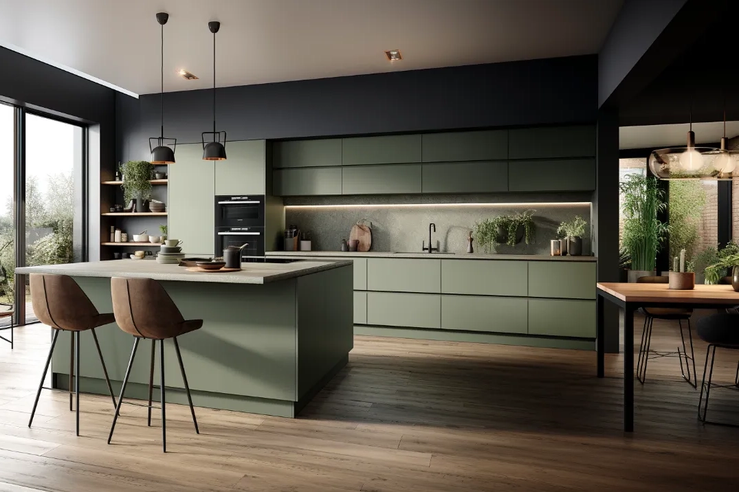
Whether it’s sage, forest, or emerald green, these colors bring life and energy to kitchen spaces. They’re versatile enough to work in multiple styles while providing that refreshing quality that makes kitchens feel renewed.
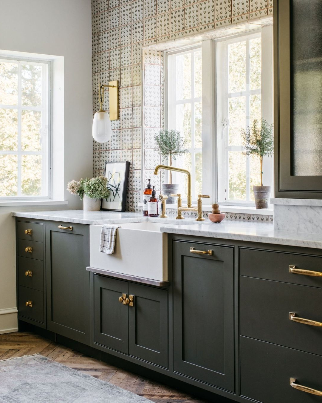
Sage green cabinets create a soft, natural look that works well in both modern and traditional kitchens. They’re particularly effective when paired with natural wood tones or stone countertops. The color has a calming effect that makes the kitchen feel like a peaceful retreat.
Forest green adds depth and richness to any space. It’s ideal for kitchens with darker wood elements or those that lean toward rustic or farmhouse aesthetics. The color works especially well in rooms with good natural light.
Emerald green is bold and luxurious. It’s perfect for homeowners who want to make a statement. This shade requires careful consideration of lighting and complementary elements, but when done right, it creates a stunning focal point.
All green variations benefit from being tested in actual kitchen conditions. The way they interact with natural and artificial lighting can dramatically affect their appearance.
Practical Considerations for Longevity
Choosing colors that last means thinking beyond just aesthetics. Practical considerations play a huge role in determining how well your kitchen colors will age.
Light colors generally show less wear and tear than dark ones. They hide water spots, fingerprints, and daily marks better, making them practical choices for busy households.
Consider your kitchen’s lighting conditions carefully. A color that looks perfect in a sunny window might appear completely different in a dimly lit corner. Testing samples in different lighting situations helps ensure long-term satisfaction.
Think about maintenance requirements. Some colors require more frequent cleaning or touch-ups than others. Darker colors, while stylish, often show stains and marks more prominently.
Finally, consider how your kitchen will evolve over time. Will you want to update it in ten years? The colors you choose today should still work well with potential future changes in decor or appliances.
The secret to choosing kitchen colors that stand the test of time lies in balancing personal taste with proven design principles. You don’t have to sacrifice your personality for longevity, but you do need to think strategically about your choices. Neutral foundations give you flexibility, while carefully selected accent colors add personality and character. The key is understanding how different hues behave in your specific space and how they’ll age over time. Remember, your kitchen is more than just a place to cook – it’s a space where memories are made and family traditions continue. Choosing colors that will remain appealing for years means investing in a space that will serve you well beyond today’s trends. Take your time with this decision. Trust your instincts, but also trust in the timeless power of well-chosen colors that have stood the test of generations.


