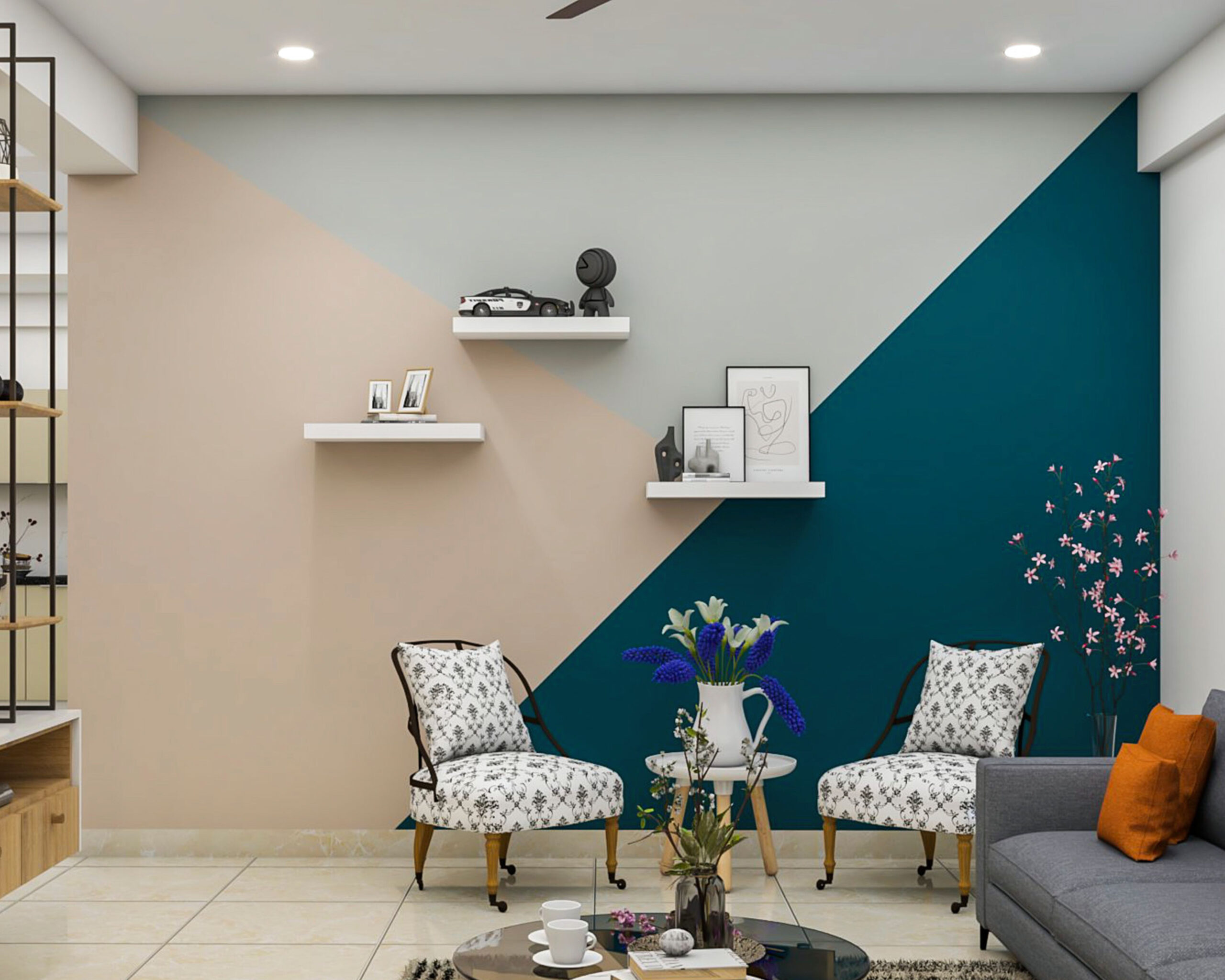
Every room tells a story, and the colors you choose are the first chapter. Whether you’re starting fresh or refreshing your existing space, understanding how to combine colors effectively can completely change the feel of your home. The right paint choices don’t just look good—they create moods, highlight features, and make spaces feel bigger or cozier. This guide explores time-tested color pairings that work across all rooms, helping you make smart decisions that stand the test of time.
Paint is one of the most powerful tools in interior design. It can make a small room feel expansive, transform a dull hallway into a welcoming entryway, or turn a tired kitchen into a bright, cheerful space. But choosing the right colors isn’t just about personal preference—it’s about understanding how colors interact, how they affect our emotions, and how they work together in harmony. The secret lies in selecting combinations that feel both fresh and familiar, elegant and approachable. These timeless color schemes have been tested through decades of use and continue to resonate with homeowners everywhere. Let’s dive into the art of creating beautiful, enduring spaces through thoughtful color choices.
The Foundation of Great Color Pairings
Before diving into specific room combinations, it helps to understand the basic principles behind successful color schemes. The key is balance—no matter how bold or subtle your choices are, they should complement each other rather than compete. Start with a base color that sets the tone for the entire room. Then add a secondary color that either matches or contrasts in a pleasing way. Consider the undertones too; a warm yellow-green might look different next to a cool gray. Think of colors like characters in a story—they need to play well together. Some of the most beloved combinations use neutral backgrounds with pops of accent colors, while others rely on harmonious tones that create unity. Understanding these fundamentals makes it easier to pick combinations that will last beyond the latest trends.
Living Rooms: Creating Warmth and Comfort
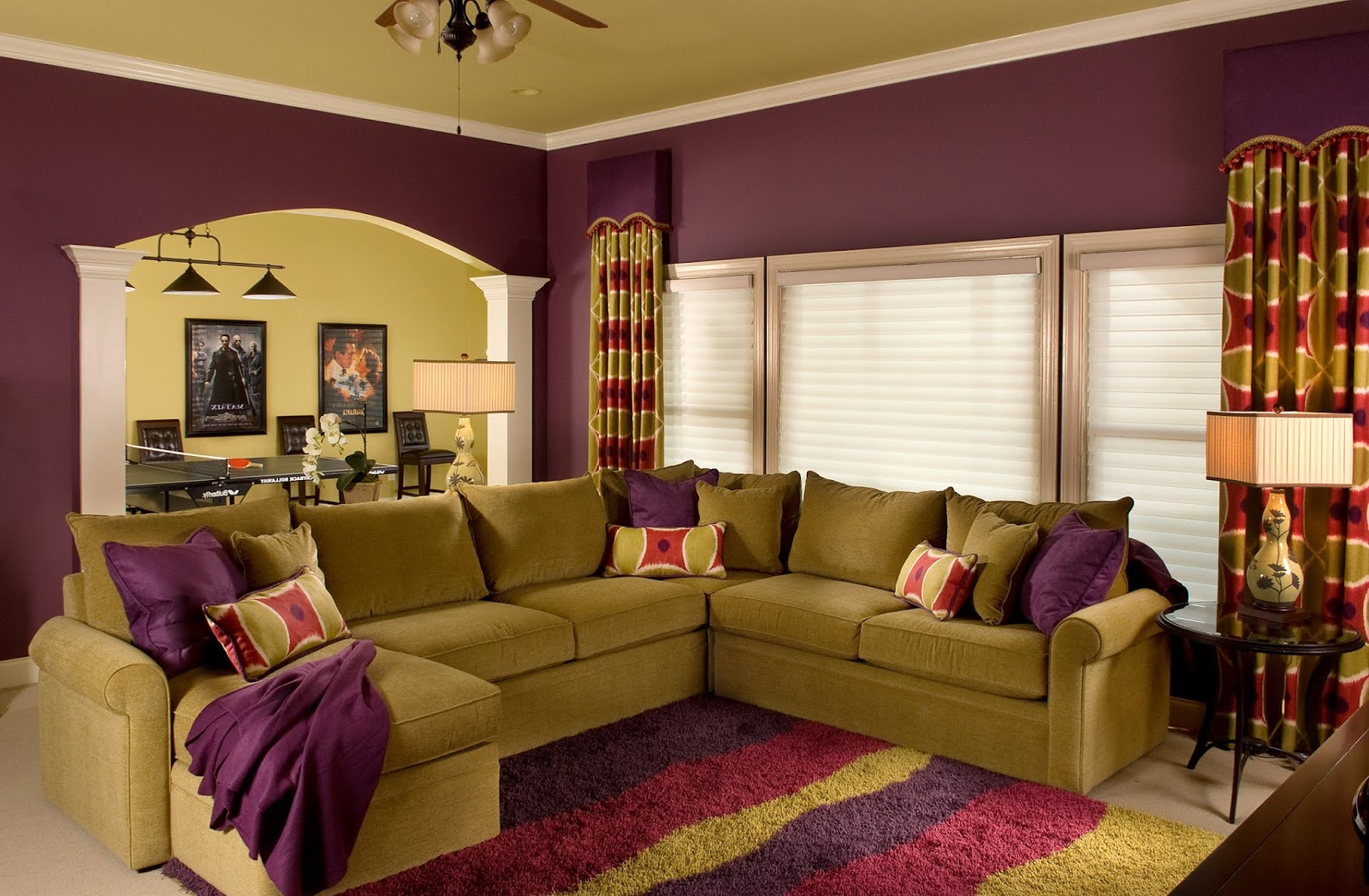
The living room is often the heart of the home, so it needs colors that invite people in and make them want to stay. Neutral backgrounds like warm beige or soft cream provide a calm canvas, allowing furniture and decor to shine. Pair these with rich accent colors such as deep burgundy or forest green for a sophisticated look. Another popular choice involves using warm grays with touches of mustard yellow or burnt orange. These combinations create a cozy atmosphere that feels both modern and timeless. For those who prefer a more dramatic effect, consider pairing charcoal gray with blush pink or lavender. The contrast brings energy without overwhelming the space. Remember, the goal is to make guests feel relaxed and comfortable—so choose colors that support that vibe.
Bedrooms: Crafting Serenity and Rest
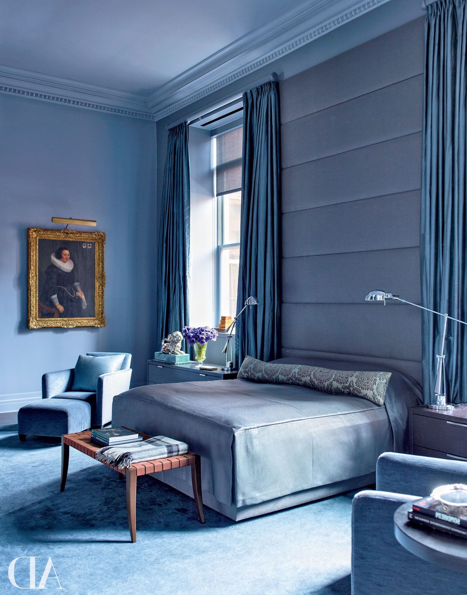
Bedrooms should feel like retreats from the outside world. Soft, calming colors promote restful sleep and peaceful mornings. Light blues and soft greens work wonderfully together, evoking feelings of tranquility and nature. Another classic combination uses pale lavender with warm whites, creating a dreamy ambiance perfect for relaxation. If you prefer something more grounded, try pairing warm beige with muted sage or dusty rose. These colors help create a serene environment where stress melts away. For those who love drama, consider using deep navy blue with silver accents. This pairing adds sophistication while maintaining a sense of calm. The key is to avoid overly bright or harsh colors that might interfere with sleep quality. Instead, focus on hues that encourage peace and restfulness.
Kitchens: Bright, Inviting, and Functional
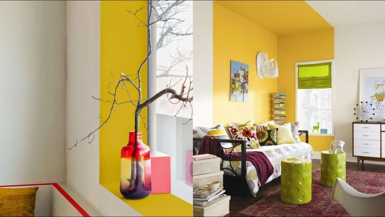
Kitchens demand colors that are both inviting and practical. They should feel fresh and clean, yet warm enough to encourage gathering and conversation. White cabinets paired with light gray walls create a clean, modern look that never goes out of style. For a more vibrant option, try pairing warm yellow with soft sage green. This combination brings energy and cheer without being overwhelming. Another effective approach uses light wood tones with cream or pale gray accents. These combinations feel natural and grounded, perfect for a kitchen where food preparation and family time happen side by side. If you’re looking for something bolder, consider pairing deep navy with crisp white or soft coral. These colors create visual interest while keeping the space feeling open and airy.
Bathrooms: Peaceful Retreats with Clean Lines
Bathrooms are spaces for renewal and relaxation, so colors should reflect that sense of calm. Soft blues and whites create a spa-like atmosphere that feels clean and refreshing. Another soothing combination uses warm beige with soft gray, offering a more contemporary take on classic bathroom aesthetics. For those who prefer a touch of luxury, pair deep charcoal with brushed gold accents. This creates a dramatic yet elegant look that feels both luxurious and restful. If you want to add some personality, consider using muted lavender with white or soft cream. These colors work beautifully in smaller bathrooms, making them feel larger and more open. The key is to choose colors that feel light and airy, even if you’re working with a small space. Avoid dark colors unless you’re using them strategically as accents.
Hallways and Entryways: First Impressions That Last
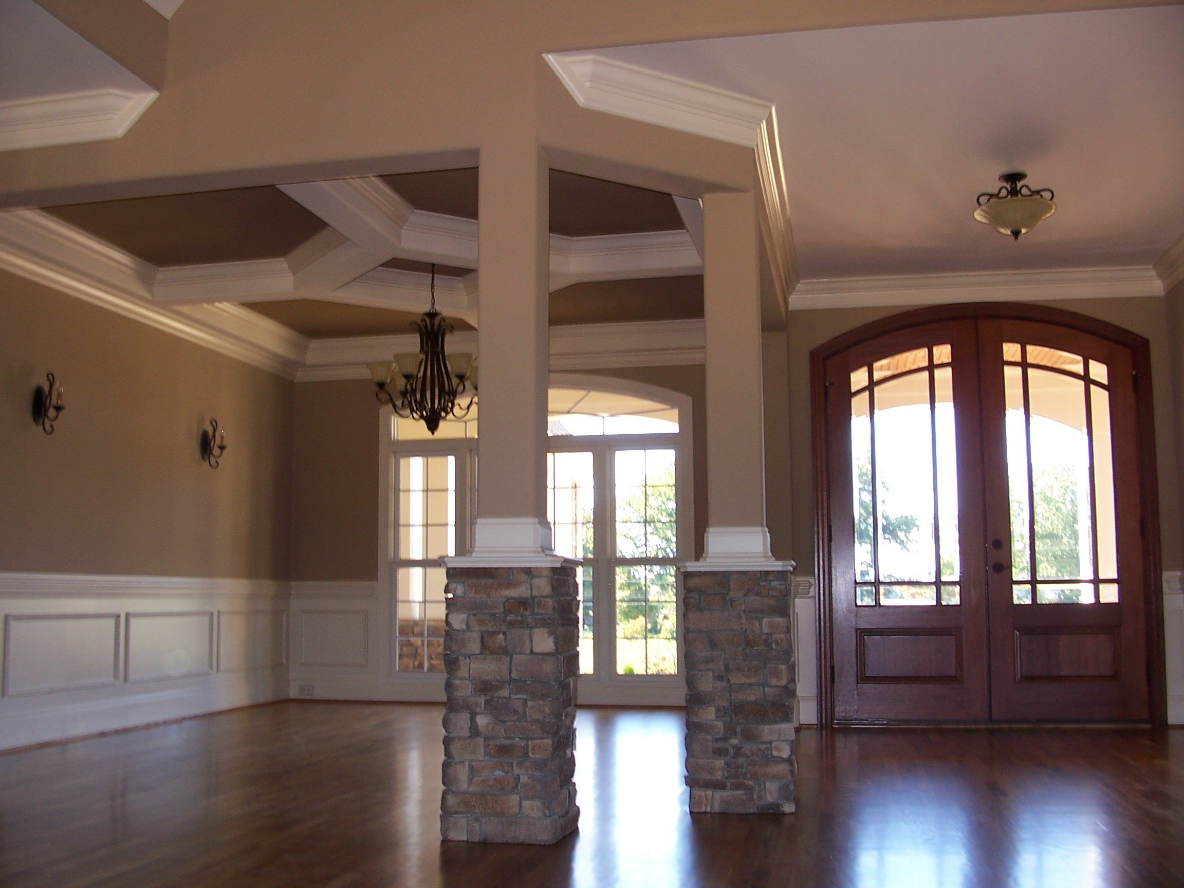
First impressions matter, especially in hallways and entryways where visitors form their initial thoughts about your home. These spaces benefit from colors that feel welcoming and timeless. Cream or warm beige walls with deep navy blue or forest green trim create a classic, elegant look that works well in any home. Another popular choice uses soft gray with warm wood tones, bringing in natural elements while maintaining a clean appearance. If you want to make a statement, try pairing bold red with neutral backgrounds. This creates an immediate impact that’s both memorable and inviting. For smaller spaces, lighter colors help make the area feel more spacious. The trick is to choose colors that reflect your personal style while ensuring they won’t date the space quickly.
Practical Tips for Choosing Long-Lasting Colors
Choosing paint colors that stand the test of time requires some thought and planning. Here are several tips to help ensure your choices remain fresh and appealing:
• Test samples in different lighting conditions throughout the day
• Consider how the color will look with your existing furniture and decor
• Choose colors that complement your natural light situation
• Select shades that work well with your lifestyle and daily routines
• Don’t be afraid to ask for professional advice when in doubt
• Remember that neutral backgrounds tend to be more versatile than bold statements
• Consider seasonal changes and how they might affect your color choices
• Plan for future updates and how new pieces might fit with your existing palette
These strategies help ensure that your color choices won’t feel dated in just a few years. The best color combinations are those that adapt to changing tastes while maintaining their fundamental appeal.
Avoiding Common Color Mistakes
Even experienced homeowners can fall into color traps that don’t quite work out as planned. Here are some frequent pitfalls to avoid:
• Using too many competing colors at once
• Ignoring how lighting affects color appearance
• Choosing colors that are too similar, making the space feel flat
• Neglecting to consider the room’s purpose and function
• Overlooking how colors will look with your furniture and accessories
• Making decisions based solely on current trends rather than timeless appeal
• Not testing paint samples in actual space conditions
• Choosing colors that don’t complement your existing decor
By being aware of these potential issues, you can make better decisions that lead to more satisfying results. Sometimes the most important decision is simply knowing what not to do.
Making Your Own Color Harmony
While established color combinations offer great starting points, don’t be afraid to experiment and create your own unique palette. Start by identifying colors you naturally gravitate toward. Then think about how these might work together. Try mixing warm and cool tones to create interesting depth. Consider adding texture through different finishes like matte, satin, or eggshell. The key is to maintain balance throughout your space. You can also use the color wheel as a guide, choosing complementary colors for maximum impact or analogous colors for a more subtle harmony. Remember that there are no hard rules—your personal preferences and lifestyle should guide your choices. What matters most is that your space feels authentic to you and brings joy every day.
When to Update Your Color Scheme
Knowing when to refresh your paint colors can be tricky. Generally, you should consider updating when:
• Your home feels stale or outdated
• You’ve made significant changes to furniture or décor
• You’re renovating or updating major fixtures
• Your lifestyle or family needs have changed
• You want to refresh a space without doing a full renovation
• You’re experiencing a life change that affects your mood
Sometimes a simple repaint can breathe new life into a space. Other times, you might need to step back and reconsider your overall approach. Pay attention to how your space makes you feel and whether it still serves your needs. If it’s time to evolve, start with small changes and build from there. Sometimes a fresh coat of paint can be the easiest and most impactful way to revitalize your home.
Choosing paint colors that transform spaces isn’t just about following trends—it’s about creating environments that feel right for you and your lifestyle. The combinations discussed here offer a solid foundation for building beautiful, lasting spaces. Whether you’re decorating a cozy bedroom, a bright kitchen, or a welcoming entryway, the right colors can make all the difference. Remember that the best color choices are those that reflect your personal style while remaining timeless in their appeal. Take your time with the process, test different options, and trust your instincts. With thoughtful planning and a bit of creativity, you can create spaces that not only look stunning but also feel wonderful to live in. Your home deserves colors that will stand the test of time—and with these timeless combinations, you’re well on your way to achieving exactly that.


