What if I told you that your kitchen’s personality could be completely redefined by choosing the right colors? It’s true. The magic happens when you understand how hue and tone work together to create stunning visual impact. Think about your favorite kitchens – they probably have something special about their color story. That’s not just luck. It’s the science of color.
Kitchens are more than functional spaces anymore. They’ve become the heart of modern homes, where families gather, friends meet, and memories are made. But beyond the appliances and countertops, there’s another element that silently shapes our daily experience – color. Whether you’re planning a complete kitchen overhaul or just want to refresh your current space, understanding how to use hue and tone effectively can transform your kitchen from ordinary to extraordinary. It’s like having a secret weapon that makes everything else look better. The right color choices can make a small kitchen feel spacious, a bright kitchen feel cozy, and a traditional kitchen feel fresh and new. It’s not just about picking pretty colors – it’s about creating harmony and balance that speaks to your soul.
Understanding Hue: The Foundation of Color
Hue is the purest form of color – think red, blue, yellow, green, and purple. It’s the base that everything else builds upon. In kitchens, hue becomes your primary tool for setting mood and style. A kitchen painted in deep blues might feel sophisticated and calming, while vibrant yellows can bring energy and cheerfulness. But here’s the thing – hue alone isn’t enough. You need to understand how different hues interact with each other and with your lighting. For instance, a rich emerald green might look amazing in a sunny kitchen, but in a dimly lit space, it could appear too dark or even muddy.
That’s why knowing your space’s natural light conditions is crucial. Consider a modern kitchen with large windows – you might want to lean toward cooler hues like soft grays or sage greens. These colors will complement the abundant daylight rather than compete with it. On the flip side, a kitchen with limited natural light benefits from warmer hues that add brightness and warmth to the room. The key is matching your hue choices to your environment.
Tone: The Subtle Art of Depth and Dimension
Tone refers to how light or dark a color appears, and it’s where things get really interesting. A color can be light, medium, or dark, and each variation brings different feelings to your kitchen. Light tones make spaces feel bigger and airier, which is perfect for smaller kitchens or those lacking natural light. Think of pale creams, soft whites, or light grays – these act as mirrors for light, bouncing it around the room. Medium tones offer balance and versatility, working well in most kitchen settings. They’re neither too bold nor too subtle, creating a comfortable middle ground.
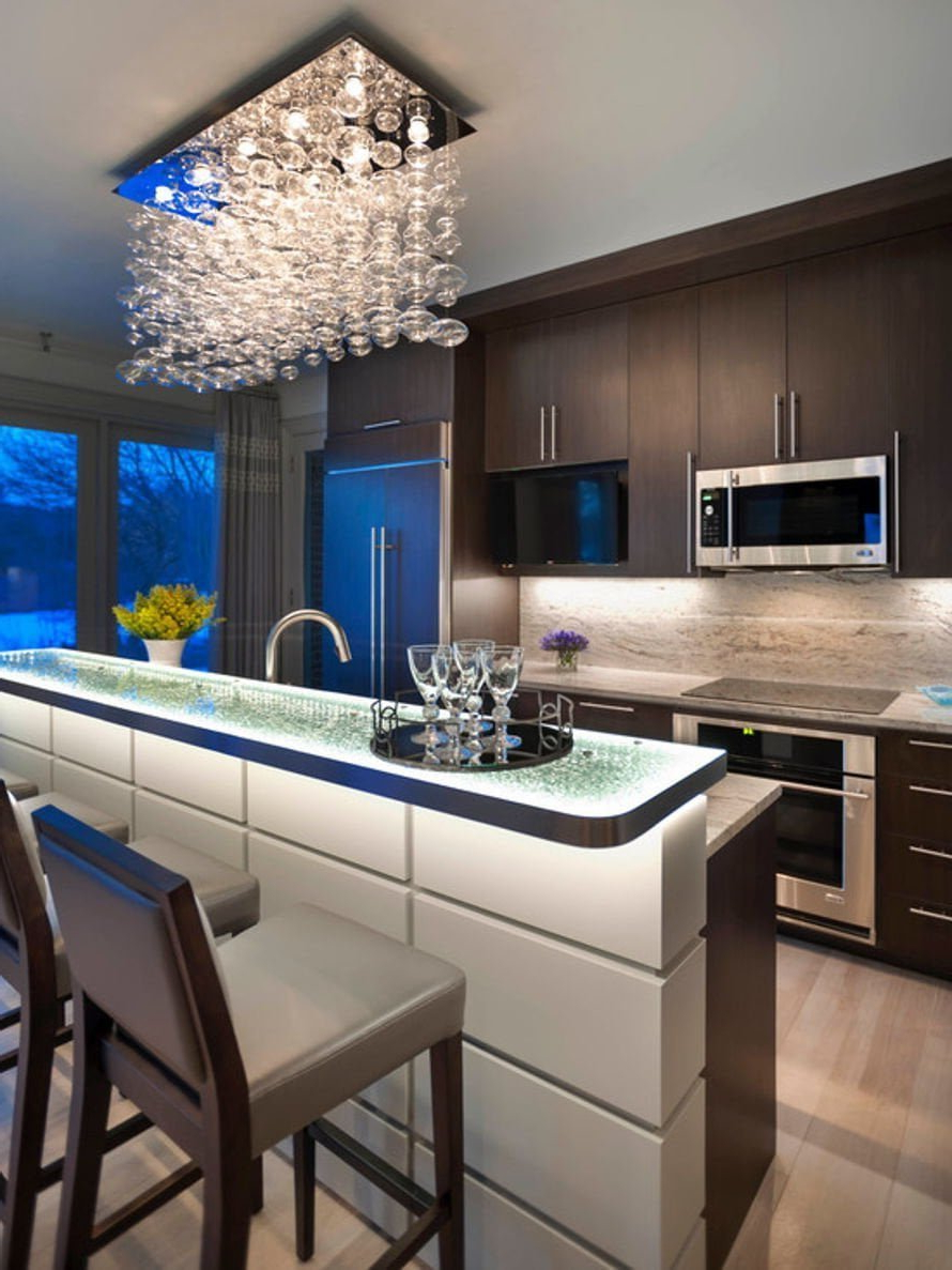
Dark tones, meanwhile, add drama and sophistication. They make spaces feel more intimate and luxurious. But here’s where it gets tricky – using too many dark tones can make a kitchen feel cramped and heavy. The secret is using them strategically. Maybe you choose a dark cabinet in one area, or use dark countertops to create contrast against lighter walls. This creates visual interest without overwhelming the space. The beauty of tone lies in its ability to change the entire character of a kitchen simply by adjusting the lightness or darkness of your chosen colors.
Harmony Through Complementary Colors
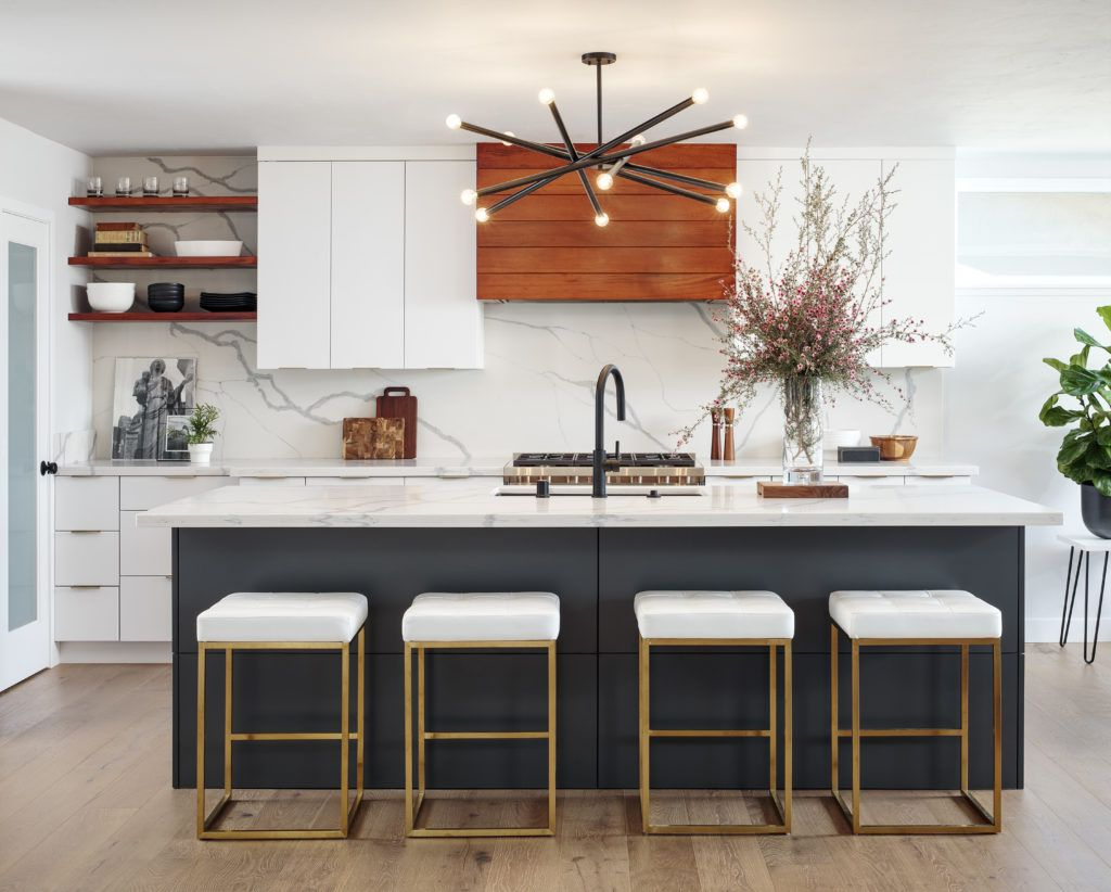
When you’re mixing hues, complementary colors are your best friend. These are pairs of colors directly opposite each other on the color wheel – like blue and orange, or purple and yellow. They create striking contrast that makes both colors pop. In kitchens, this technique works wonderfully for adding focal points without going overboard. Imagine a kitchen with white cabinets and a navy blue island. The navy blue creates a strong anchor while the white keeps the space feeling open and clean. But here’s what many people miss – it’s not just about using two colors.
You can incorporate complementary tones throughout your kitchen to create visual interest. Maybe you use a blue accent wall, then add orange accessories like a vase or a few cushions. Or perhaps you choose a yellow backsplash that contrasts beautifully with a green countertop. The key is to establish one dominant color and use the complementary as accents. This way, you get that dynamic contrast without creating chaos. It’s like having a conversation between colors – they talk to each other across the room, creating movement and energy.
Monochromatic Magic for Modern Elegance
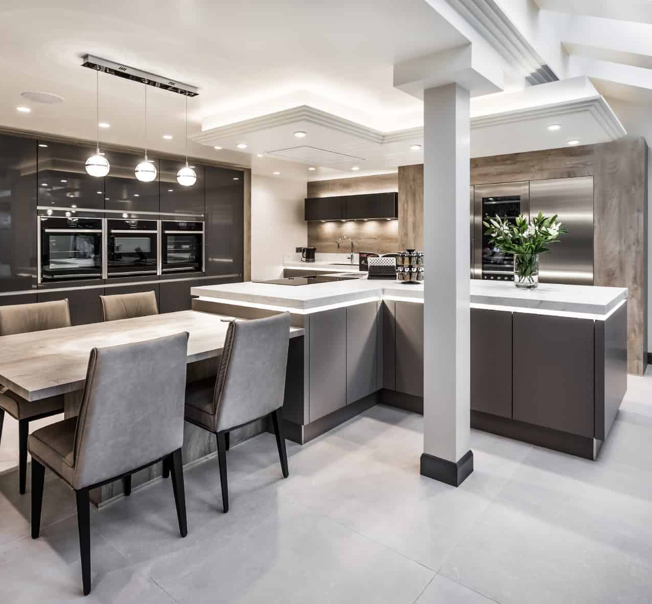
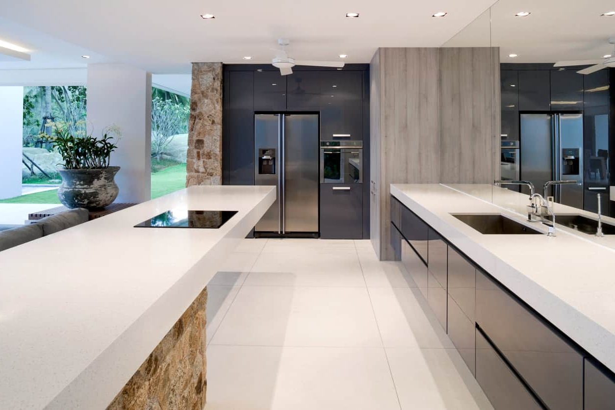
Sometimes less really is more, especially when you’re going for that sleek, modern look. Monochromatic color schemes use variations of a single hue – think different shades of blue, or various tones of gray. This approach creates a sense of calm and sophistication that feels very contemporary. It’s particularly effective in kitchens because it allows the materials and textures to shine. You might have a kitchen with different shades of gray – from light silver to deep charcoal – but they all work together seamlessly. The trick is to vary the tones enough to avoid monotony.
A kitchen that’s all the same shade of gray can feel flat and boring. Instead, mix light and dark tones, warm and cool undertones, and different finishes. This creates depth and dimension while maintaining that clean, modern aesthetic. The result is a space that feels intentional and well-designed. Monochromatic schemes also make it easy to update your kitchen later – just change one element, like a new backsplash or some new hardware, and the whole look changes. It’s a smart investment in timeless design.
Warm vs Cool Tones: Creating the Right Mood
The difference between warm and cool tones can completely shift how a kitchen feels. Warm tones – reds, oranges, yellows, and browns – create a cozy, inviting atmosphere. They’re perfect for kitchens where you want to encourage gathering and conversation. Think of a warm beige or cream kitchen that makes everyone feel welcome. Cool tones – blues, greens, and purples – tend to make spaces feel more spacious and calm. They’re ideal for busy kitchens where you want to create a sense of serenity. A kitchen with soft blues can feel refreshing, almost like being in a peaceful garden. But here’s where it gets interesting – you can combine both warm and cool tones in the same kitchen for maximum effect.
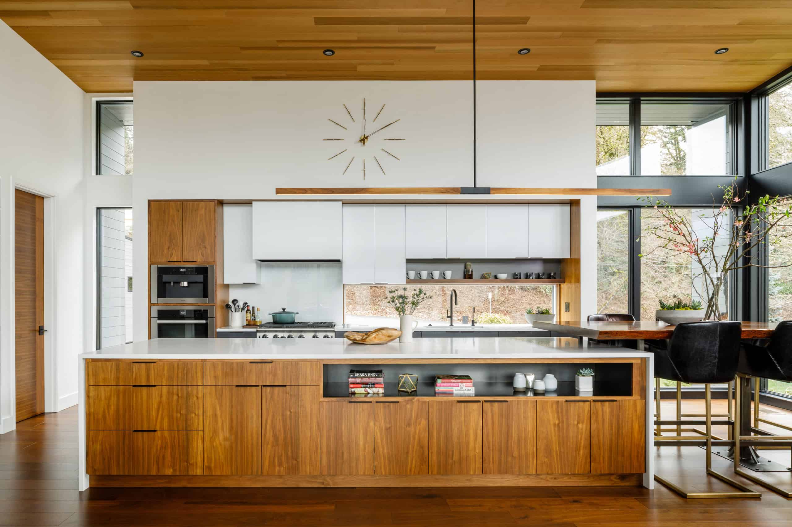
The key is balance. If you have a warm kitchen, you might add a touch of cool blue in the form of a backsplash or a few decorative items. Or if you’re going for a cool kitchen, consider incorporating warm wood tones or brass fixtures to add personality. This blend creates visual interest while keeping the overall feel consistent. The goal is to match your color choices to the mood you want to create. Do you want your kitchen to feel like a retreat or a lively social hub? Your color choices can make that happen.
Practical Tips for Successful Color Application
Now that we’ve covered the theory, let’s talk about putting it into practice. Start by testing your colors on small sections of your kitchen walls before committing to full coverage. This simple step saves you from major regrets later. Also, consider the size of your kitchen when choosing colors. Lighter tones work wonders in small spaces, while darker tones can make larger kitchens feel cozier. Don’t forget to account for how your lighting changes throughout the day. What looks great in morning light might seem different under evening bulbs. Another tip is to think about the materials in your kitchen.
Wood grain, metal finishes, and stone countertops all have their own color characteristics that will affect how your paint or tile colors appear. If you’re using natural wood cabinets, you might want to choose colors that complement rather than compete with the wood’s natural tones. Finally, remember that color is personal. While there are guidelines, ultimately your kitchen should reflect your taste and lifestyle. Consider what makes you happy when you’re in the space. Does it inspire you to cook? Does it make you want to spend time there? These emotional connections matter more than any color chart.
Color is more than just decoration – it’s a powerful tool that shapes our daily experiences and emotions. In kitchens, where we spend so much time, thoughtful color choices can make all the difference. Whether you’re drawn to bold complementary pairs or prefer the quiet elegance of monochromatic schemes, understanding hue and tone gives you the power to transform your space. The key is starting with intention – knowing what mood you want to create and choosing colors that support that vision. Remember, your kitchen is your personal sanctuary, and the right color palette can make it feel like exactly that. So go ahead, experiment with your colors, trust your instincts, and enjoy the journey of creating a space that truly feels like home. After all, the most beautiful kitchens aren’t just about what they look like – they’re about how they make you feel.
